
Cart
You've measured your wall three times. Maybe four. The tape measure says 360 cm, but you're still not confident because every time you look at "127cm," you wonder if it's too small or awkwardly placed. Every guide says something different, and none account for the fact that your sofa sits 8-10 inches off the wall, or that your wall has a window on one side. You keep second-guessing: is 127cm actually right?
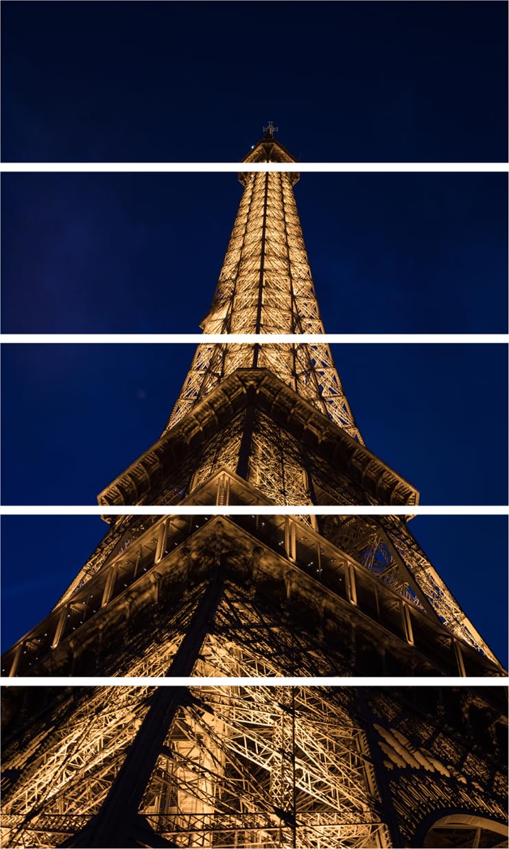
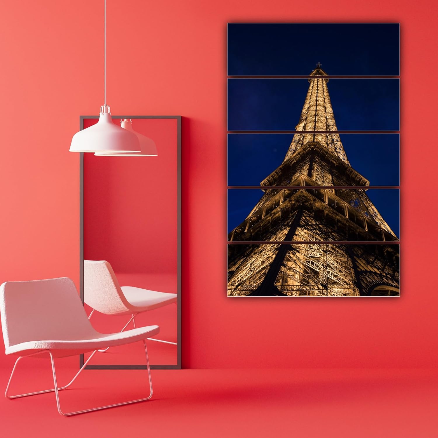
Here's what 127cm means in your living room: if your wall is 12 feet (360cm), this canvas covers 35% of the width. That's 116cm of space on the left, 116cm on the right. Your sofa is probably 6-8 feet wide (180-240cm), which means this painting sits centered above it with 20-40cm margins on each side. The 5-panel layout adds visual rhythm—your eye tracks left to right across the Eiffel Tower's structure, which makes the 127cm width feel more substantial than a single-frame piece of the same size.
The golden amber lighting of the Eiffel Tower against the deep navy blue twilight backdrop works specifically because Indian living room walls are typically cream, off-white, or builder's peach. The warm gold tones pull visual weight without clashing, while the navy blue recedes just enough to create depth. If your walls are cream, the gold will glow warmer in morning sunlight streaming through east-facing windows. If your walls are peach-toned, the navy blue provides cooling contrast. Your brown or beige sofa fabric acts as a neutral bridge between the artwork's colors and your wall color.
A 12-foot wall (360cm) is standard in Indian homes—flats built post-2010, 2BHK to 3BHK layouts. At 127cm width, this canvas occupies just over one-third of your wall space. Mathematically: 127 ÷ 360 = 35%. That leaves 233cm for balance—enough space that the painting doesn't feel crammed, but substantial enough that it doesn't look like a postcard floating in empty space.
If you go smaller—say, 100cm—you'd have 260cm of unused wall space. The Eiffel Tower would look tentative, especially if your ceiling is 9-10 feet tall. The vertical 76cm height needs horizontal width to anchor it visually. If you go bigger—150cm or more—you're approaching 42% wall coverage, which starts competing with your furniture rather than complementing it. The 5-panel design spans 127cm with small gaps between frames, so your eye perceives it as a unified composition, not five separate pieces.
Your sofa is probably 6-8 feet wide. If it's 7 feet (210cm), this 127cm painting leaves 41cm margins on each side when centered. That's roughly 16 inches per side—enough clearance that the painting doesn't touch your sofa arms, but close enough to create visual connection. If your sofa is pushed against the wall, the painting hangs 15-20cm above the backrest. If there's a 10-inch gap between sofa and wall (common in rentals where you avoid wall scuffs), the painting still reads as "above the sofa" from across the room.
The Eiffel Tower's golden amber lighting isn't flat yellow—it's warm, layered tones that shift depending on your room's light sources. In morning sunlight (east-facing windows), the amber picks up slightly orange undertones. Under evening LED bulbs (warm white, 2700K-3000K typical in Indian homes), the gold deepens into rich honey tones. The navy blue background stays consistent because dark blues absorb light rather than reflect it—meaning it won't look drastically different between day and night.
Your cream walls have a slight yellow or pink undertone (depending on whether your builder used "ivory" or "peach" base paint). The golden amber in this painting harmonizes with that warmth. If your walls are off-white with cooler grey undertones, the navy blue provides temperature balance—the painting won't feel too warm or too cool. Your brown fabric sofa, whether it's chocolate brown or sandy beige, sits neutrally between the painting's colors and your wall color, which is why brown furniture is the safest bet for colorful wall art.
The 5-panel format creates micro-contrasts: each panel shows a different vertical section of the Eiffel Tower, from the illuminated base to the pointed summit against the twilight sky. This means as you move through the room—walking from your dining area to the sofa—the angles shift slightly, and you notice different details. It's not a static image; it has dimensionality that single-frame canvases lack.
Your landlord's deposit is probably ₹50,000 or more. The last thing you need is wall damage from drilling mistakes. This 5-panel canvas weighs 3 kilograms total—that's roughly 600 grams per panel. Each panel is 0.6cm deep, meaning it sits close to the wall rather than jutting out awkwardly.
Use 3M Command Picture Hanging Strips (the large size, rated for 2-3 kg per pair). You'll need two strips per panel—ten strips total. Cost: ₹300-400. These strips adhere to painted walls without drilling, and they remove cleanly by stretching downward. If you're nervous, test one strip on a hidden section of wall (behind furniture) and remove it after 24 hours to confirm your paint doesn't peel.
Alternatively, use hardwall hangers (small nails with three tiny prongs). These leave holes smaller than a thumbtack—barely visible when you move out, and easily filled with a dab of toothpaste or white correction fluid. Each panel needs one hanger. Tap gently with a hammer wrapped in cloth to avoid noise complaints if you're hanging this on a weekend morning.
Spacing between panels: The painting arrives with pre-installed hanging hardware and spacing guides. Standard gap is 2-3cm between panels. Total horizontal span with gaps: approximately 130-135cm including the small spaces. Mark your wall's center point (180cm from either edge on a 360cm wall), then work outward to position the panels symmetrically.
If your walls are textured (common in Indian flats—rough finish or "lollipop" texture), 3M strips might not adhere well. In that case, use monkey hooks (twisted wire hooks that slip behind drywall) or adhesive hooks rated for textured surfaces. If your walls are concrete (older buildings), you'll need wall plugs and screws—drill two holes per panel, 5mm depth.
You've probably looked at 100cm, 127cm, and 150cm+ sizes. Here's what changes:
100cm canvas on a 12-foot wall: 28% coverage. Leaves 260cm unused space. If your sofa is 7 feet wide, the painting looks undersized—like it's floating uncertainly above the furniture. The Eiffel Tower's vertical structure loses impact when the horizontal width is constrained. Your guests might not notice it immediately when they enter the room, which defeats the purpose of a statement piece.
127cm canvas (this one) on a 12-foot wall: 35% coverage. Balanced. The 5-panel format adds visual weight through repetition—five frames register as more substantial than a single frame of the same total width. The painting commands attention without dominating. When someone sits on your sofa, the artwork is in their peripheral vision (comfortable), not looming overhead (awkward).
150cm+ canvas on a 12-foot wall: 42%+ coverage. Starts feeling tight. If your wall has a window on one side or a door on the other, a 150cm painting crowds those elements. The Eiffel Tower imagery is already vertically dramatic—adding more horizontal width tips into "too much." You'd need higher ceilings (10+ feet) to balance the scale.
The 76cm height is calibrated for 9-10 foot ceilings (standard in Indian flats built after 2000). If you hang this 15cm above your sofa backrest (common), the top of the canvas sits at roughly 180-190cm from the floor—just below eye level when you're standing. This is the "sweet spot" for wall art: high enough to be protected from accidental kicks or leaning furniture, low enough that you don't crane your neck to see it.
If you go with a taller canvas—say, 100cm or 120cm height—you're approaching ceiling proximity. At 76cm, you have 90-120cm of clearance between the painting's top edge and your ceiling, which gives the artwork breathing room. Taller pieces can make ceilings feel lower, especially in 9-foot ceiling homes.
Your living room probably gets morning sunlight if it faces east or southeast (typical in Indian flat layouts). Between 7 AM and 10 AM, natural light hits the canvas at an angle. The golden amber tones in the Eiffel Tower will glow slightly brighter—almost like the tower is genuinely illuminated. The navy blue background stays dark because blue pigments absorb light rather than reflect it. This contrast intensifies: the tower feels closer, the sky recedes.
By afternoon (2 PM - 5 PM), if your living room doesn't get direct sunlight (west-facing windows are in bedrooms, typically), the canvas relies on ambient diffused light. The colors stabilize—the amber is still warm but less glowing, the navy blue softens slightly. This is when the painting looks closest to how it appears in product photos: balanced, not overly dramatic.
Evening is when your LED bulbs take over. Indian homes typically use warm white LEDs (2700K-3000K) or neutral white (4000K). Warm white makes the golden amber deepen into honey or burnt orange tones—the Eiffel Tower feels cozier, more intimate. Neutral white keeps the colors accurate but slightly cooler—the navy blue reads as true navy rather than tipping toward purple or grey.
If you use tube lights (cool white, 5000K+), the painting will look slightly desaturated—the golden amber loses some warmth, the navy blue can appear more grey. This isn't a defect; it's how cool-temperature light interacts with warm-colored pigments. If color vibrancy matters to you, stick with warm white or neutral white LEDs in the living room.
One detail that matters: viewing distance. If you sit on the sofa directly below the painting, you're about 60-80cm away (close). At this distance, you'll notice the canvas weave texture and the individual panel frames. This is normal—canvas isn't meant to be viewed from 2 feet away. Step back 6-8 feet (across the room, near your dining table), and the Eiffel Tower unifies into a cohesive image. The 5-panel breaks disappear; you see the full structure from base to summit.
Product photos are shot in studio conditions: even white lighting, neutral backgrounds, color-calibrated cameras. Your living room has cream walls, brown furniture, maybe a patterned rug, natural sunlight mixing with LED bulbs. The painting will look different in your space—not worse, just different.
The golden amber will feel warmer in your home because it reflects your wall color. If your walls have a slight yellow undertone (common in "ivory" paint), the amber picks that up and intensifies it. If your walls are cooler off-white, the amber provides contrast without clashing. The navy blue background might appear slightly lighter in bright afternoon light—this is normal. Dark colors lighten when exposed to strong light sources because your eyes adjust for contrast.
The 340 GSM canvas has a slight texture—tiny raised fibers that catch light. This isn't a glossy poster; it's meant to have dimensionality. Under direct light, you'll see this texture. Under diffused light or from a distance, the texture smooths out visually. Some people love this tactile quality; some prefer ultra-smooth finishes. If you've never owned canvas wall art, expect a linen-like weave, not photo-paper smoothness.
The pinewood frame (1.5 inches thick) sits flush against the canvas edges. It's not a decorative ornate frame—it's a minimal structural frame that keeps the canvas taut. The wood is kiln-dried to 12% moisture content, which means it won't warp in Indian monsoon humidity (70-85%). If you live in coastal cities (Mumbai, Chennai) or high-humidity areas, this matters—cheap frames warp within months.
The eco-solvent inks are UV-resistant, meaning the colors won't fade if indirect sunlight hits the canvas. Direct harsh sunlight (like a south-facing window with no curtains) will still cause gradual fading over years, but normal living room light won't damage it. If you're worried, hang it on a wall perpendicular to windows rather than directly opposite them.